Create Pivottable
With a PivotModel, we can easily create a Pivottable component.
Create a Pivottable
Given a PivotModel, creating a Pivottable is as simple as
<pivottable model="${model}" />
Attributes
Grand totals
You can show or hide grand total rows or columns by specfiying
<pivottable model="${model}" grandTotalForColumns="false"
	grandTotalForRows="false" />
Default values are true.
Data orientation
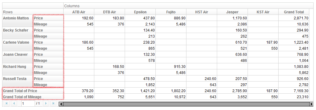
Data orientation means how to arrange data when there are more than one data fields. For example, if we specify "Price" and "Mileage" as data field,
<pivottable model="${model}" dataOrient="column" />
gives
and
<pivottable model="${model}" dataOrient="row" />
will give
Title Cells
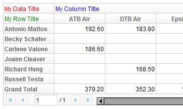
Pivottable can accept up to 3 child components, which will represent the 3 title cells in the order of data title, column title, and row title. For example,
<pivottable model="${model}">
	<div style="color: red">My Data Title</div>
	<div style="color: blue">My Column Title</div>
	<div style="color: green">My Row Title</div>
</pivottable>
results in
Paging
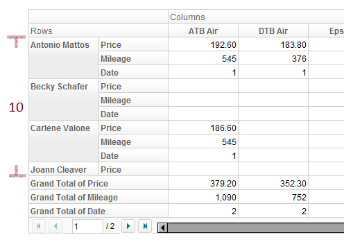
As you have noticed, Pivottable has built-in paging support. Like Paging on Grid or Listbox, you can set page size and current page number. For example,
<!-- suppose model has Price, Mileage, Date as data field -->
<pivottable model="${model}" pageSize="10" dataOrient="row" />
Note:
- Page size does not include the size of grand total rows.
- Default page size is 20.
Manipulation
Users can interact with a Pivottable in the following way:
- Open/close header nodes by clicking on the plus/minus sign on row and column fields.
- Resize column width by dragging their edge.
Other actions are available through call Pivottable API and PivotModel API. The next section will introduce samples of wiring these API to the user interface.
Version History
| Version | Date | Content |
|---|---|---|


